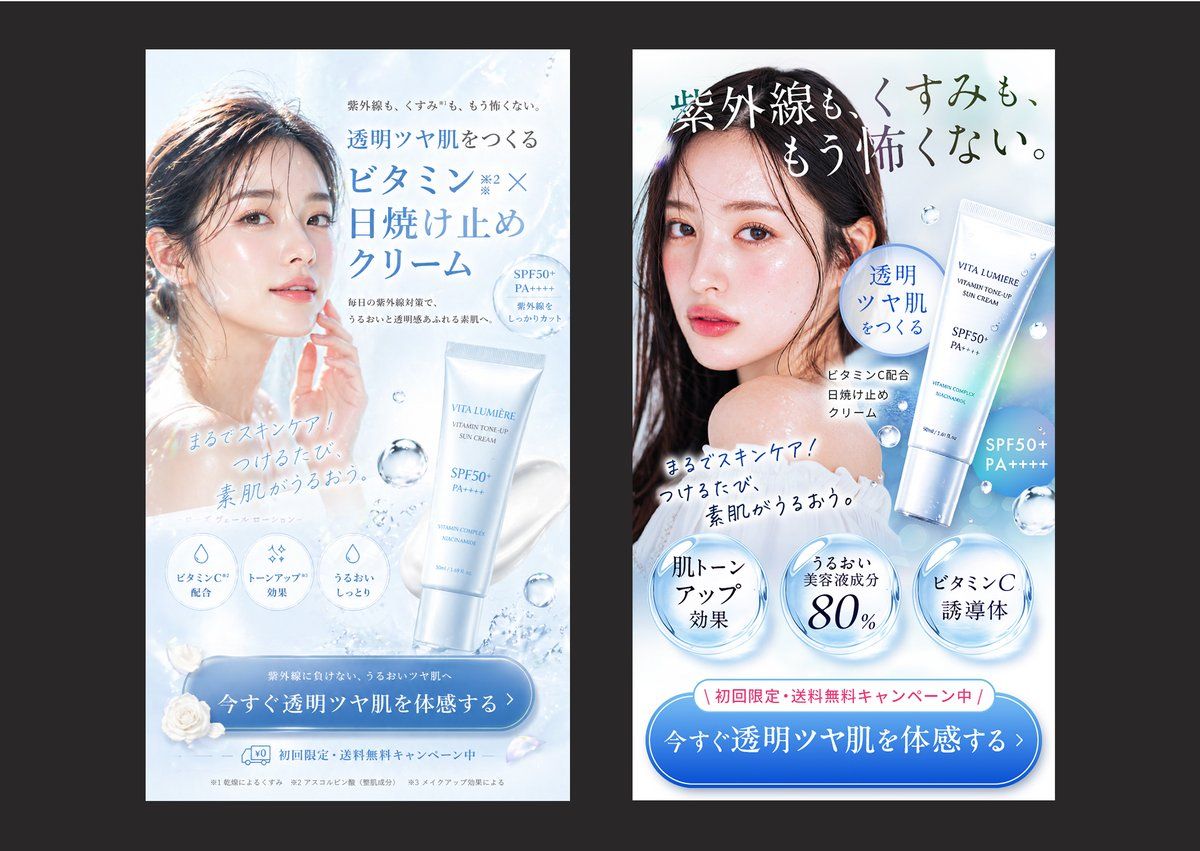
日本护肤品广告对比
Prompt
Create a side-by-side comparison image showing 2 vertical Japanese skincare advertisement banners on a dark charcoal background, each banner framed as a clean smartphone-style ad mockup with a white and icy blue beauty aesthetic. The left banner should look elegant and visually polished but less sales-driven: a soft backlit close-up of a woman with wet-looking dark hair and luminous bare skin, her face partially obscured by a centered rectangular blur block, pale blue water textures, floating droplets, a white-and-silver sunscreen tube labeled {argument name="product name" default="VITA LUMIÈRE"} near the lower right, refined Japanese serif and sans-serif typography, and a large blue rounded CTA button at the bottom. Include the headline in Japanese: 「透明ツヤ肌をつくる ビタミンC×日焼け止めクリーム」, small supporting copy above and below, 3 circular benefit icons near the lower middle, the handwritten-style subcopy 「まるでスキンケア!つけるたび、素肌がうるおう。」, and a bottom CTA button reading 「今すぐ透明ツヤ肌を体感する」. The right banner should be a stronger direct-response version of the same product and model, with clearer hierarchy, bolder copy, and more persuasive conversion elements: a larger dramatic Japanese headline across the top reading 「紫外線も、くすみも、もう怖くない。」, the same model again with a centered rectangular blur over the face, the product tube shown larger on the right, a blue speech-bubble badge reading 「透明ツヤ肌をつくる」, the same handwritten-style subcopy angled across the chest area, 3 large glossy circular claim badges along the lower middle reading 「肌トーンアップ効果」, 「うるおい美容液成分80%」, and 「ビタミンC誘導体」, plus a pink campaign strip above the CTA reading 「初回限定・送料無料キャンペーン中」. The right CTA button should be larger and more prominent, reading 「今すぐ透明ツヤ肌を体感する」. Use a bright cool palette of white, ice blue, silver, and faint holographic highlights, realistic cosmetic product rendering, soft water splash accents, translucent bubbles, premium Japanese beauty-ad styling, high contrast between headline and CTA, and a clear visual impression that the right ad is more persuasive and conversion-optimized than the left.- Category
- Charts & Infographics
- Model
- GPT Image 2
- Creator
- クリュウ|AI使い倒す広告マーケター
- Source ID
- 17657
- Published
- May 1, 2026
Views3